ext_153082 (![[identity profile]](https://www.dreamwidth.org/img/silk/identity/openid.png) tsunderes.livejournal.com) wrote in
tsunderes.livejournal.com) wrote in ![[community profile]](https://www.dreamwidth.org/img/silk/identity/community.png) iconography2010-12-23 07:48 pm
iconography2010-12-23 07:48 pm
manga coloring tutorial
So! This is for Setine, who asked, but anyone else is welcome to use it, of course. It's a really basic tutorial, and I don't promise that my shading is "correct," but it's what I do. Today I'll be coloring Kiyoha from Sakuran--I'll also note that the texture techniques I use in this tutorial are awesome, but they're certainly not a part of all of my icons. Since Kiyoha is a geisha (sort of), I used Japanese fabric textures for the background and clothing since it'd look better than just plain colors and is super easy.
 ⇒
⇒ 

So here's our base. I think it's dark, and has some screening issues, so let's get rid of those before we start.

Duplicate the base and set it to screen at 66%.

Then use Levels--they are a hidden treasure for anyone making icons. I only recently learned about them and I love them dearly. Just brighten it up a little bit more without loosing the black areas' definition. Here, my input values were 0, 0.69, and 238. I also don't recommend messing around with output values at all.

The background and clothing will be a pattern, so it doesn't matter if there is screening left--the pattern will effectively cover that up. But since the skin is going to be solid colors, I just used a brush eyedropped to the color (white, duh) and colored out the screening issues myself.
Now you're done pre-coloring! Merge all of your layers and set it to multiply.

Set your background underneath the base layer. Also, the patterns I use come from this site, which is absolutely fabulous for Japanese patterns.

So, skin first! The way I tackle coloring is to take the "farthest" portion first. That is, what area are other colors and patterns going to be layered over? Then you just work your way up. So here, I go skin ⇒ hair + decorations ⇒ makeup ⇒ clothing. Also, while coloring skin, I just hide the background pattern layer, since that can make it hard to see the lines. If you're going to be coloring with a very light color, I recommend making another layer filled with a grey so that you can see where you're going.
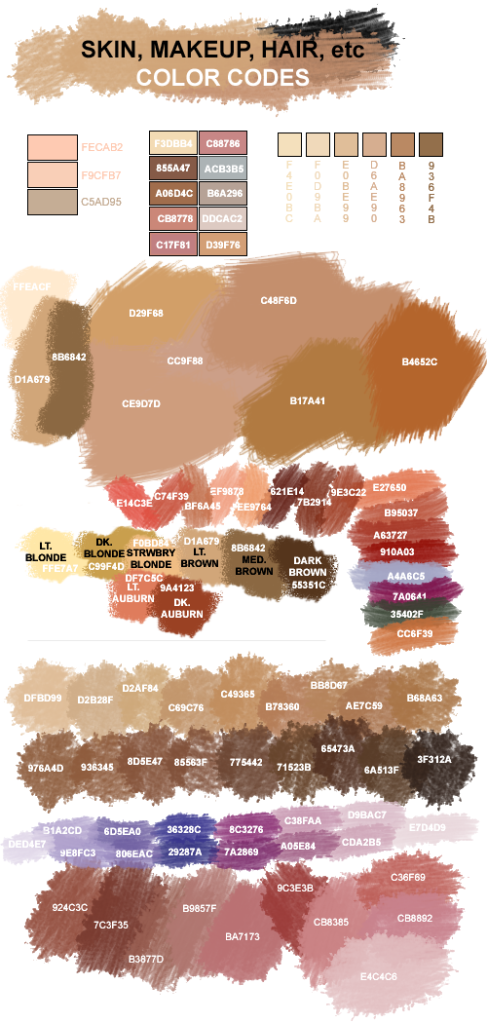
Fill the skin area with a base color. I use #FFE8D4 for most of my icons because it works well with my coloring once it's finished. I highly recommend experimenting with different skin tones to find one that works well with your personal style, since a skin tone is really easy to make odd.

Then deal with the shadows. Again, my shadows and highlights are likely not 100% accurate, but I'm also not terribly picky. Highlights and shadows are something you just kind of have to learn, for which there are many many tutorials by better iconists and artists than me. Just pick a light source and keep to it. With manga, I tend to make my light source opposite of the lines defining the nose. So here, the lightsource is going to come from the upper, left side.
For shadows, just use your base skin tone, but set the layer to multiply. If the shadows look too dark, lower the opacity until it looks better, but here, I like how it looks at 100%.

Apply the gaussian blur filter on your shadows at 2.0 to soften them a bit. For the shadow under Kiyoha's chin, I also used the blur tool to extend the shadow farther, since just a dot will taper out the best.

Then for highlights, just use white. I basically just fill in the areas that are still that base skin tone, but not completely. Remember the skeletal structure underneath and it's easier.

Apply a gaussian blur at 4.0 to the highlights.

That's way too bright, though, so lower the opacity. For Kiyoha, I use around 55%. And you're done with the skin, which is the hardest part!

Then I colored in the hair, eyes and hair decorations. You can do this in separate layers if you want, but that's just personal preference. You'll also note that my coloring is a bit sloppy--I don't care much about everything being perfectly inside the lines or doing highlights/shadows because remember, this is being colored to resize to 100x100, so the detail is going to disappear.

Now! This is quite specific to Kiyoha, but if you're doing icons where the character wears makeup, this may be useful? Essentially, you apply makeup on icons the same way you do on yourself, but for those of you that may be make-up challenged (moi) or dudes, I'll be going piece by piece. First of all, since Kiyoha is a geisha, I just cover her skin with a layer of off-white, since pure white looks really odd.
For really specific makeup like geisha makeup, I recommend getting a picture of it and eyedropping the colors and using it as reference. So the "white" (#F6F5FA) is what I got when I used the eyedrop tool on a bright part of a geisha's makeup, and I took care to not cover the base of the hair and the ear(s) and to make part of the distinctive pattern on the neck. You don't have to be too specific here, but enough to have a hint on the final icon.

This, of course, covers up all your hard work on the skin shading, so lower the opacity to a good level. Here, I used 65%. There's still a hint of the shadows, but it's not as pronounced.
 ⇒
⇒ 
Now more common make-up! For choosing makeup colors, I recommend eyedropping from pictures, or using this guide, though not 100% of the time. I'm particular to a particular color for Kiyoha's lips and eyeshadow, so I use those.
For her lipstick, I make a dot of red in the center, or against the "farthest" edge in this 3/4 shot. Then use the blur tool to fill the rest of the lips. Why not just use the brush, you ask?

Well, if you just use the brush, it can end up looking like clown make-up! It's not as bad here as in some other icons, but the blur tool is your friend when it comes to soft edged areas.
 ⇒
⇒ 
For eyeshadow, make a dot of the color where it'll be the most intense. For normal eyeshadow, this would be in the center of the eyelid. But for geisha makeup, it's centered around the corners of the eyes. So with that dot, use the blur tool to drag it around the rest of the eye and soften the edges.

Again, just using the brush does not look very pretty!

Now you're done with the coloring, so hide the base layer and keep the background texture hidden. Merge the hair/skin layers so that you can work with them more easily for your clothing textures. Not bad!
Choosing good textures for clothing is really important. If you use a bad texture, that won't go away because you're sizing it down. Use something that's been scanned in flat. Using a texture with wrinkles can look really bad. If you want to simulate wrinkles and changes in dimension, just cut out piece of fabric and layer them over each other--it'll work just as well. Color is also really important, of course, but just use fashion sense in that regard. For Kiyoha, her kimonos generally use red, or at least vibrant colors.
 ⇒
⇒ 
So start on your first piece of clothing. Add the layer on top of the base and move it around so that it covers the piece you want it to be. Once you have it where you want, just move it underneath the base.
Then, erase the bits of the texture that are in places you don't want them to be. I recommend lowering the texture's opacity to see the base's lines more clearly, and keeping the skin and background texture hidden.
 ⇒
⇒ 
A tip to make this go more quickly: just use the eraser tool on the outside edge of the line to make a line. Then use the magic wand/selection tool on maximum tolerance and select the area you don't want there. Then just cut it out, and voila! Custom fit.
Just repeat this technique until you get the clothing how you want. So here's the progression of my kimono textures:


Then unhide all your layers and you're all done! This seems like a lot, but honestly, reading this tutorial probably takes longer than this method once you get good at erasing textures! Apply coloring as you want, or if you're satisfied, just resize. Once I finished this icon off, I ended up with this:

Anyways, I hope that's helpful to someone! If you have any questions, feel free to ask. ♥
⇒ So here's our base. I think it's dark, and has some screening issues, so let's get rid of those before we start.
Duplicate the base and set it to screen at 66%.
Then use Levels--they are a hidden treasure for anyone making icons. I only recently learned about them and I love them dearly. Just brighten it up a little bit more without loosing the black areas' definition. Here, my input values were 0, 0.69, and 238. I also don't recommend messing around with output values at all.
The background and clothing will be a pattern, so it doesn't matter if there is screening left--the pattern will effectively cover that up. But since the skin is going to be solid colors, I just used a brush eyedropped to the color (white, duh) and colored out the screening issues myself.
Now you're done pre-coloring! Merge all of your layers and set it to multiply.
Set your background underneath the base layer. Also, the patterns I use come from this site, which is absolutely fabulous for Japanese patterns.
So, skin first! The way I tackle coloring is to take the "farthest" portion first. That is, what area are other colors and patterns going to be layered over? Then you just work your way up. So here, I go skin ⇒ hair + decorations ⇒ makeup ⇒ clothing. Also, while coloring skin, I just hide the background pattern layer, since that can make it hard to see the lines. If you're going to be coloring with a very light color, I recommend making another layer filled with a grey so that you can see where you're going.
Fill the skin area with a base color. I use #FFE8D4 for most of my icons because it works well with my coloring once it's finished. I highly recommend experimenting with different skin tones to find one that works well with your personal style, since a skin tone is really easy to make odd.
Then deal with the shadows. Again, my shadows and highlights are likely not 100% accurate, but I'm also not terribly picky. Highlights and shadows are something you just kind of have to learn, for which there are many many tutorials by better iconists and artists than me. Just pick a light source and keep to it. With manga, I tend to make my light source opposite of the lines defining the nose. So here, the lightsource is going to come from the upper, left side.
For shadows, just use your base skin tone, but set the layer to multiply. If the shadows look too dark, lower the opacity until it looks better, but here, I like how it looks at 100%.
Apply the gaussian blur filter on your shadows at 2.0 to soften them a bit. For the shadow under Kiyoha's chin, I also used the blur tool to extend the shadow farther, since just a dot will taper out the best.
Then for highlights, just use white. I basically just fill in the areas that are still that base skin tone, but not completely. Remember the skeletal structure underneath and it's easier.
Apply a gaussian blur at 4.0 to the highlights.
That's way too bright, though, so lower the opacity. For Kiyoha, I use around 55%. And you're done with the skin, which is the hardest part!
Then I colored in the hair, eyes and hair decorations. You can do this in separate layers if you want, but that's just personal preference. You'll also note that my coloring is a bit sloppy--I don't care much about everything being perfectly inside the lines or doing highlights/shadows because remember, this is being colored to resize to 100x100, so the detail is going to disappear.
Now! This is quite specific to Kiyoha, but if you're doing icons where the character wears makeup, this may be useful? Essentially, you apply makeup on icons the same way you do on yourself, but for those of you that may be make-up challenged (moi) or dudes, I'll be going piece by piece. First of all, since Kiyoha is a geisha, I just cover her skin with a layer of off-white, since pure white looks really odd.
For really specific makeup like geisha makeup, I recommend getting a picture of it and eyedropping the colors and using it as reference. So the "white" (#F6F5FA) is what I got when I used the eyedrop tool on a bright part of a geisha's makeup, and I took care to not cover the base of the hair and the ear(s) and to make part of the distinctive pattern on the neck. You don't have to be too specific here, but enough to have a hint on the final icon.
This, of course, covers up all your hard work on the skin shading, so lower the opacity to a good level. Here, I used 65%. There's still a hint of the shadows, but it's not as pronounced.
⇒ Now more common make-up! For choosing makeup colors, I recommend eyedropping from pictures, or using this guide, though not 100% of the time. I'm particular to a particular color for Kiyoha's lips and eyeshadow, so I use those.
For her lipstick, I make a dot of red in the center, or against the "farthest" edge in this 3/4 shot. Then use the blur tool to fill the rest of the lips. Why not just use the brush, you ask?
Well, if you just use the brush, it can end up looking like clown make-up! It's not as bad here as in some other icons, but the blur tool is your friend when it comes to soft edged areas.
⇒ For eyeshadow, make a dot of the color where it'll be the most intense. For normal eyeshadow, this would be in the center of the eyelid. But for geisha makeup, it's centered around the corners of the eyes. So with that dot, use the blur tool to drag it around the rest of the eye and soften the edges.
Again, just using the brush does not look very pretty!
Now you're done with the coloring, so hide the base layer and keep the background texture hidden. Merge the hair/skin layers so that you can work with them more easily for your clothing textures. Not bad!
Choosing good textures for clothing is really important. If you use a bad texture, that won't go away because you're sizing it down. Use something that's been scanned in flat. Using a texture with wrinkles can look really bad. If you want to simulate wrinkles and changes in dimension, just cut out piece of fabric and layer them over each other--it'll work just as well. Color is also really important, of course, but just use fashion sense in that regard. For Kiyoha, her kimonos generally use red, or at least vibrant colors.
⇒ So start on your first piece of clothing. Add the layer on top of the base and move it around so that it covers the piece you want it to be. Once you have it where you want, just move it underneath the base.
Then, erase the bits of the texture that are in places you don't want them to be. I recommend lowering the texture's opacity to see the base's lines more clearly, and keeping the skin and background texture hidden.
⇒ A tip to make this go more quickly: just use the eraser tool on the outside edge of the line to make a line. Then use the magic wand/selection tool on maximum tolerance and select the area you don't want there. Then just cut it out, and voila! Custom fit.
Just repeat this technique until you get the clothing how you want. So here's the progression of my kimono textures:
Then unhide all your layers and you're all done! This seems like a lot, but honestly, reading this tutorial probably takes longer than this method once you get good at erasing textures! Apply coloring as you want, or if you're satisfied, just resize. Once I finished this icon off, I ended up with this:
Anyways, I hope that's helpful to someone! If you have any questions, feel free to ask. ♥